Fleet Management
A connected platform for fleet drivers and fleet managers, designed to monitor vehicles, protect driver wellbeing, and keep an entire fleet visible from a single screen. Built from scratch alongside UI designers, developers, a project manager, and a design lead.
What is the Fleet Management System
A product built for fleet drivers and fleet managers in the automobile industry, to monitor vehicles and stay connected, in real time, across desktop, tablet, and mobile.
Fleet operators were relying on a patchwork of spreadsheets and disconnected systems to track vehicles, drivers, and deliveries, with no single source of truth for what needed attention, and no way to see, at a glance, where things stood across a distributed fleet.
Design a product for fleet drivers and fleet managers to monitor vehicles and stay connected, enabling managers to record and act on vehicle and driver conditions at any time, from any device.
Built from scratch, alongside a full product team
UX design and information architecture for the web and mobile applications of a Fleet Management platform, focused on creating intuitive, data-driven user experiences.
This project started with a blank page. I worked alongside UI designers, developers, a project manager, and a design lead, taking the product from an early idea through to a working, presentable design. I was involved from the very first brainstorming sessions, reviewed ideas with stakeholders throughout, and presented flow charts and early mockups back to the wider team for feedback and sign-off.
Key Contributions
- End-to-end UX: designed the full user experience across both the web and mobile products used in fleet management operations.
- Information architecture: structured the IA and interaction flows to simplify genuinely complex operational workflows.
- Usability testing: conducted and applied usability insights to refine navigation, task flows, and overall product usability.
- Data-informed design: translated user behaviour data into design decisions that improved usability and engagement.
- Cross-functional collaboration: worked closely with product managers, developers, and stakeholders to deliver a scalable, user-centric solution.
Altimetrik is a global digital transformation company headquartered in Southfield, Michigan, helping Fortune 500 organisations across financial services, retail, automotive, healthcare, and manufacturing accelerate digital innovation and customer experience transformation.
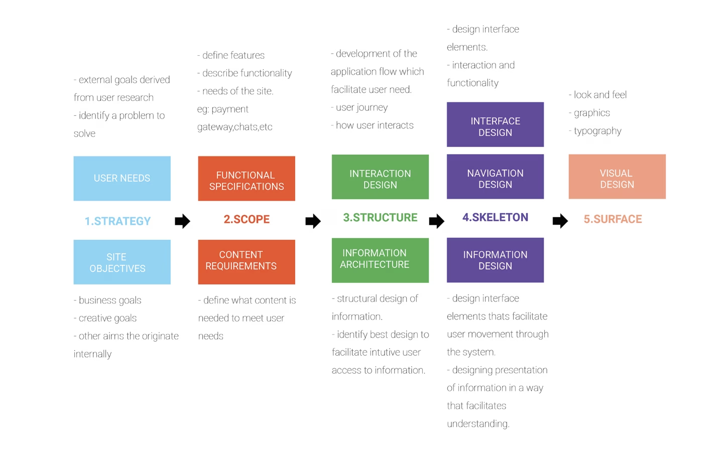
Five planes, strategy to surface
The project followed the five-plane UX methodology, moving from abstract to concrete, from why the product should exist to exactly what it looks like on screen.
Strategy
User needs and site objectives, grounded in research and business goals.
Scope
Functional specs and content requirements: defining features and what supports them.
Structure
Interaction design and information architecture: how users move through the system.
Skeleton
Interface, navigation, and information design: the shape of every screen.
Surface
Visual design: look, feel, typography, and graphics.
UX Objectives
- Minimally invasive interface: the system shouldn’t demand constant, focused attention from someone who is, first and foremost, driving.
- Multi-sensory feedback: pairing visual alerts with audio cues so critical information doesn’t rely on eyes-on-screen.
- Asynchronous control: the command centre monitors continuously but intervenes only when needed, rather than requiring constant oversight.
- Clear, purposeful UX writing: every piece of copy earns its place, helping users understand flow and status at a glance.
Understanding the ecosystem and its people
The connected vehicle platform sits at the centre of five stakeholder groups, each feeding into one unified experience.
| Enterprise | Fleet management, field workforce apps, ride share, logistics |
| Dealers | Service history, scheduling, inventory, customer service |
| Manufacturer | Vehicle usage & performance data for product improvement |
| Infrastructure | Real-time weather, traffic information, tolling |
| Other vehicles | Road conditions, congestion, incidents |
Personas
Mike Ross, Truck Driver
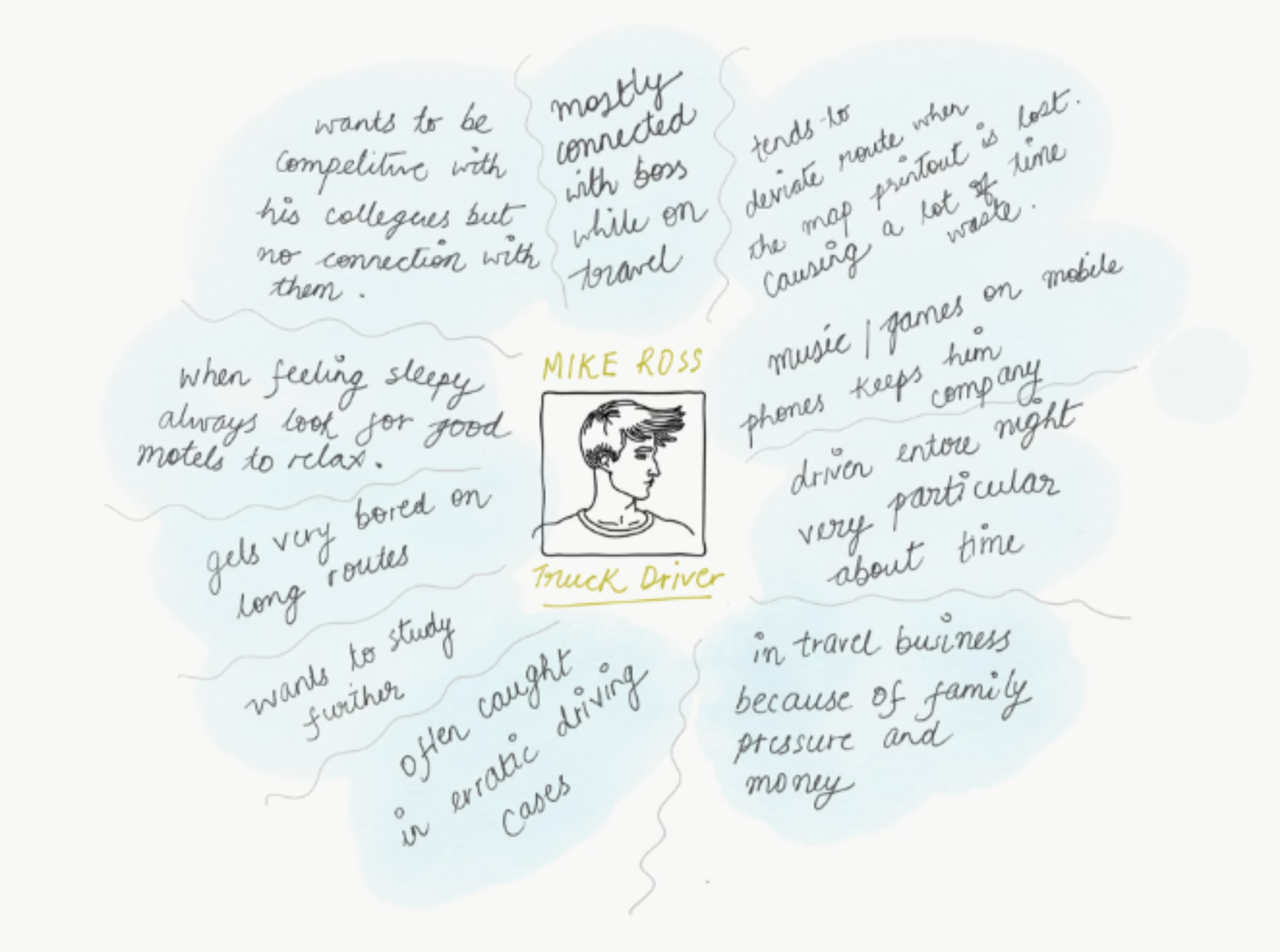
Hired straight out of high school by Harvey Transport Inc., Mike is the frontline user: long, odd hours, minimal human interaction, a job that’s both monotonous and high-stakes. A typical day starts at the depot at 6pm: inspecting the vehicle, printing a paper map, and checking his phone charger, before heading out as traffic dies down.
His empathy map surfaced key tensions: he wants to stay connected to dispatch while on the road, gets bored on long routes, is prone to deviating when a printed map goes stale, and is often driving under pressure from family and financial obligations.
Rob Turner, Operations Manager, ABC Energy
Manages a fleet of 60 vans across 21 offices nationwide. Previously juggling multiple systems and spreadsheets, Rob needed one central platform offering maintenance reminders, fuel records, third-party GPS and fuel-card integration, and driver management, all in one place.
Jack & Abby, Farm-to-Door Delivery Business
Founders of a home-delivery operation running refrigerated vans to 1,000+ clients sourcing from around 100 farms. Their priority: better visibility into delivery van status and more consistent preventative maintenance, to cut breakdowns, towing costs, and stress.
A Fleet Management System, built around five capabilities
Vehicle Telematics · Driver Management · Speed Management · Fuel Management · Health & Safety Management.
System Architecture
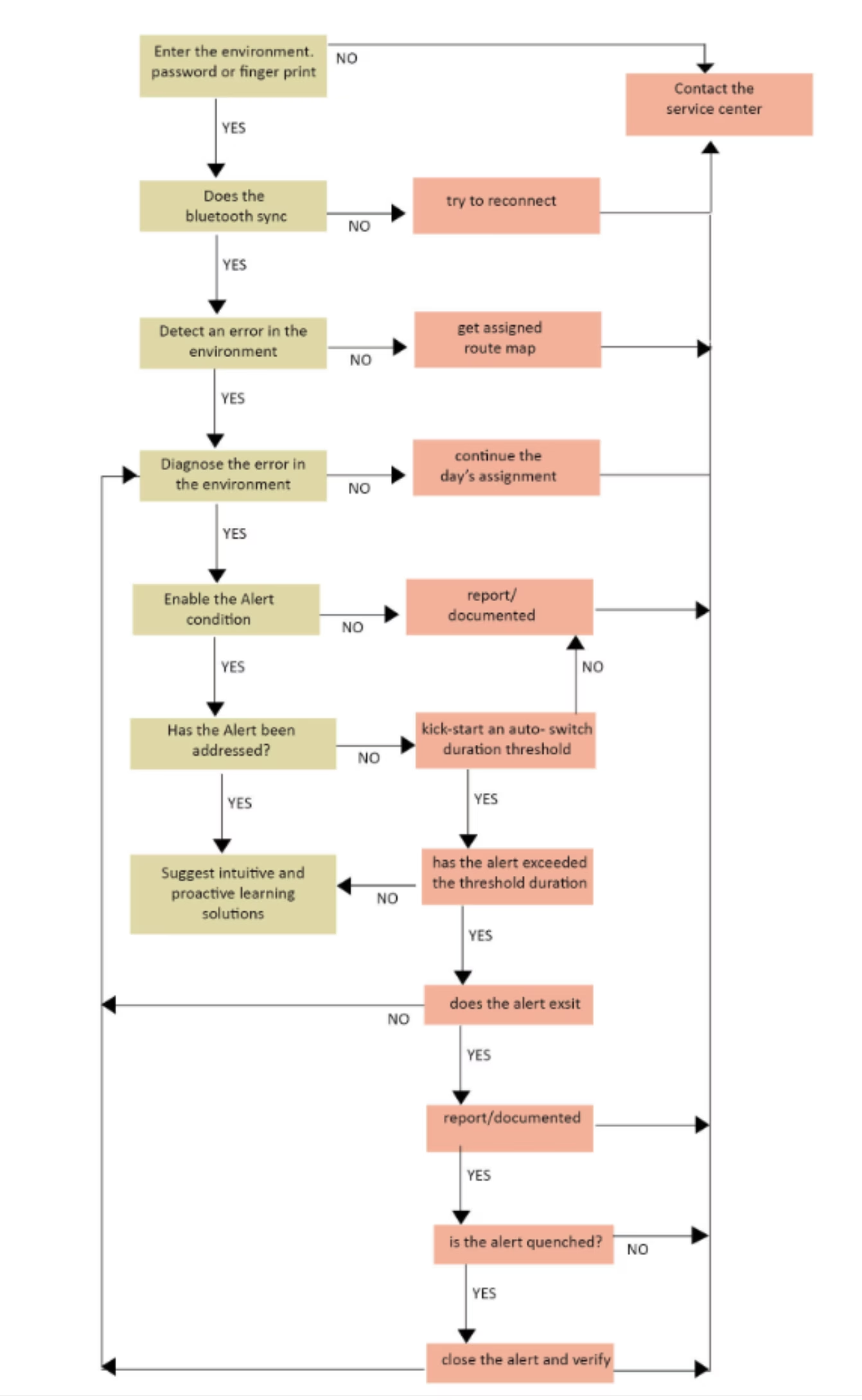
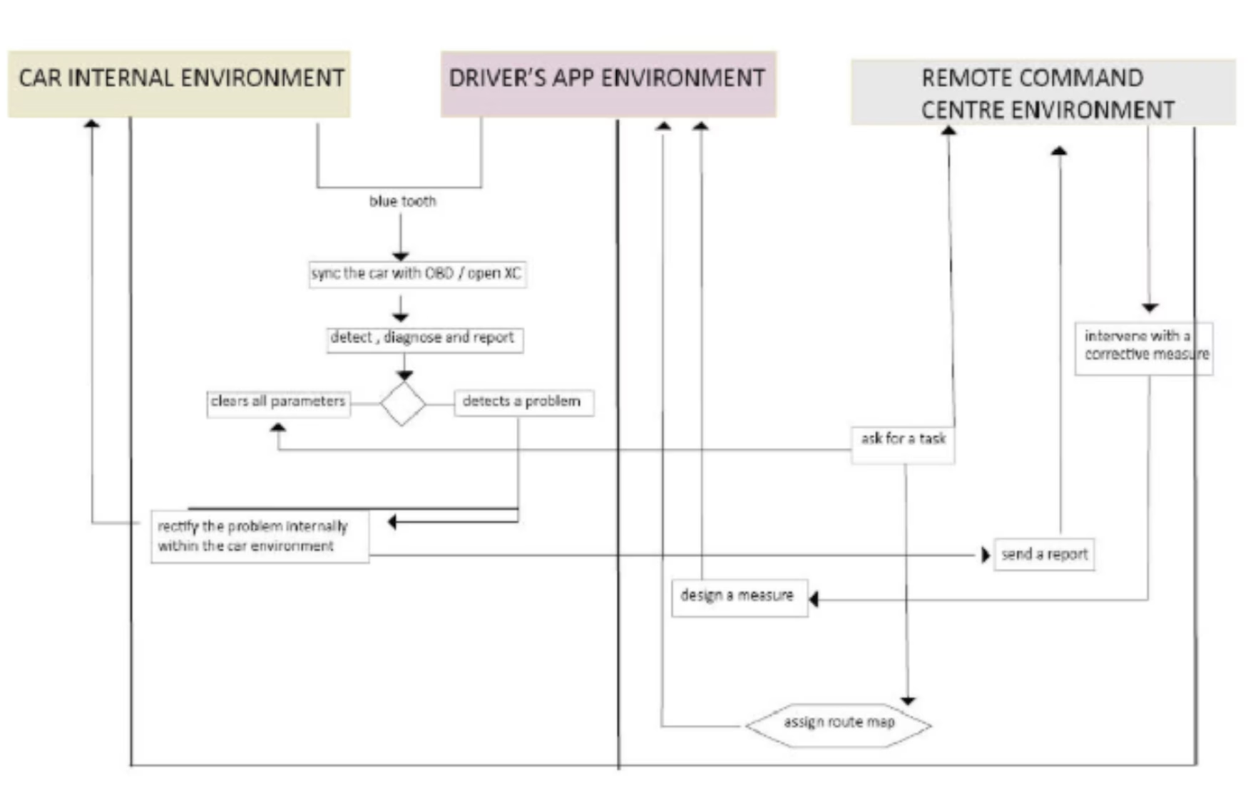
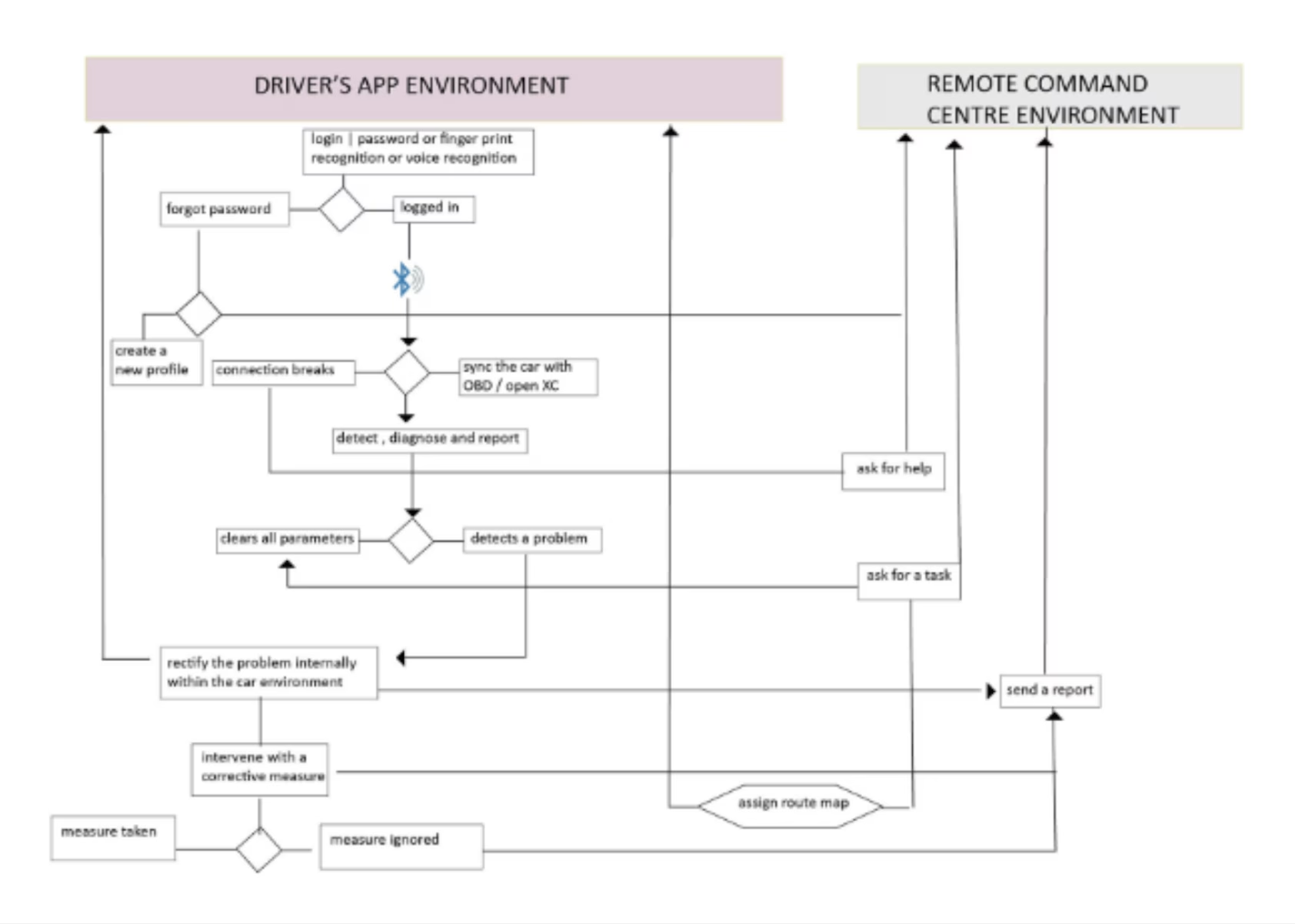
The platform connects three environments: the car’s internal systems, the driver’s app, and the remote command centre, via Bluetooth sync to an OBD (On-Board Diagnostics) / OpenXC interface.
- OBD (On-Board Diagnostics) is the standard port built into every modern car that reads the vehicle’s internal data: speed, fuel level, engine health, and more.
- OpenXC works like a translator for the car. It takes all that raw vehicle data and converts it into a simple format that apps can easily understand and use, making it possible for the Driver Companion App to “speak” to the vehicle in real time.
The car environment continuously detects, diagnoses, and reports issues, self-correcting where it can. Unresolved issues escalate to the command centre, which can design and send a corrective measure back to the vehicle or driver.
Four building blocks
A) Telematics Data Acquisition
Integration with an OBD-II adaptor, or an equivalent hardware/software simulator, to pull live vehicle data.
B) Driver Companion App
An Android app rendering real-time vehicle and driver vitals, and receiving route suggestions and messages from central fleet command.
C) Concept Algorithms & Approach
Dynamic route optimisation from A to B, updating in real time. On a low-fuel alert, the app proactively redirects the driver to the nearest gas station.
D) Central Web Console
A web interface visualising the central fleet command function, with real-time vehicle maps.
Driver Companion App: Functional Flow
- Driver logs in with username and password.
- The app greets the driver by name.
- It receives the optimised route to the scheduled destination.
- It surfaces trip details: cargo type, distance, ETA.
- It integrates with the driver’s Fitbit for live health vitals.
- Once the trip starts, vehicle and driver vitals stream continuously to the server.
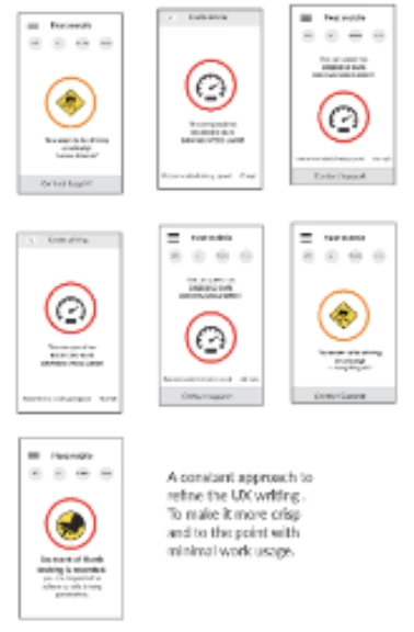
- Throughout transit, the app detects and alerts on: lack of breaks or sleep deprivation, low blood pressure, harsh braking, route deviation, over-speeding, and low tire pressure.
Central Web Console: Functional Flow
- The console opens to a live geographic map showing every vehicle in motion.
- Each vehicle icon is colour-coded red or green, based on overall health.
- Clicking a vehicle surfaces its optimised route on the map.
- The panel shows three vital sets: vehicle parameters, driver health parameters, and conceptually, cargo parameters such as refrigeration temperature.
- Managers can message the driver directly, or add and reorder waypoints, from the same panel.
- Driver vitals render live from a connected Fitbit device, with a direct option to dial 911.
- Vehicles moving with a red alert flag either a vehicle-parameter issue or a driver-health issue, prompting the manager to act.
From paper sketches to a working interface
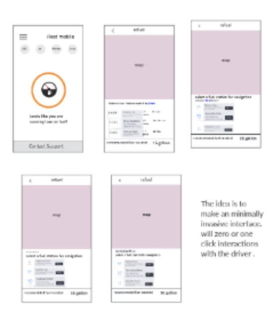
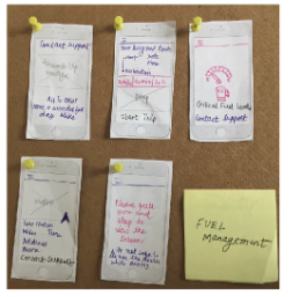
Design began with paper sketches and low-fidelity wireframes for both the Driver Companion App and Central Web Console, validating the “minimally invasive” interface concept before any visual polish. The wireframes deliberately kept driver-facing screens to zero or one-click interactions.
The Driver Companion App follows a simple sequence: sign-in → device connectivity check → assignment brief → live route map, with a single “Start the Trip” action moving the driver forward.
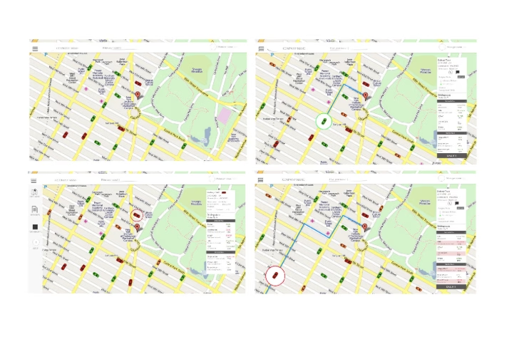
The console evolved into a single-page interface built around a live map: vehicles colour-coded green, orange, or red, with hover states revealing vehicle name, number, and driver at a glance.
Detect quietly, alert clearly, and offer a single next action: never more than the driver needs in the moment.
Every alert, one clear next step
Fuel Management
Speed Management
Driver Health Management
Vehicle Health Management
Driver Safety Management
What this project taught me
The result is a system that treats the driver’s attention as a scarce resource, and the fleet manager’s oversight as a single-glance responsibility, collapsing what used to be scattered spreadsheets and disconnected tools into one live, colour-coded view of an entire fleet’s health, safety, and progress.
Designing for a driver in motion meant every interaction had to earn its place: nothing on screen that wasn’t essential, nothing that pulled focus from the road. That constraint shaped every decision, from the single-tap trip start to the colour-coded map that lets a fleet manager triage an entire fleet at a glance.