Maximus
Pro
One of the world’s earliest end to end connected platforms for motorcycles rebuilt for the Indian rider.
What is Maximus Pro
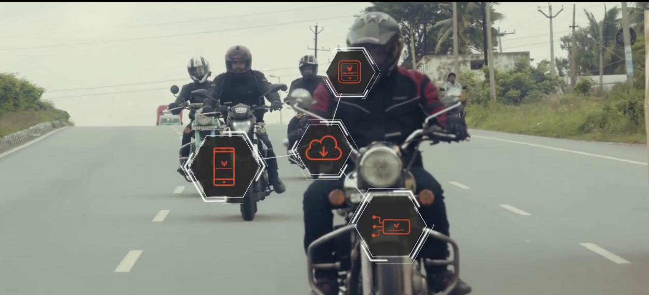
Maximus Pro, developed by KPIT Technologies, is one of the world’s earliest end to end connected platforms for motorcycles. It combines a handlebar mounted display module with a smartphone app and cloud analytics giving riders distraction free navigation, real time bike diagnostics, safety alerts, and a connected riding community, all in one platform.
The hardware display module was developed in collaboration with Map Project Office, a London based industrial design studio. My responsibility was the mobile app platform the primary interface through which riders planned, tracked, and relived their journeys.
“One of the world’s earliest end to end connected platforms for motorcycles combining hardware, mobile app and cloud analytics into one integrated riding experience.”
First designer on the project
I joined KPIT as Lead UX Designer the first dedicated designer on the Maximus Pro project. The mobile app had already been built by the engineering team using existing design libraries, with no designer involved. I came in to redesign it properly, improving the experience, interface, and flows, while simultaneously designing new screens for the next version update.
I reported directly to the Technology Head and worked alongside a UI designer, collaborating closely with marketing, development, and engineering teams across the business.
End-to-end UX of the mobile app · User research · A/B testing · Navigation icon adaptation for Indian roads · Design system · Wireframes · Prototypes · Design specifications · Next version screens
Redesign a live, already deployed app built without a designer while designing ahead for the next release with a fixed launch date at India Bike Week already in the calendar.
Discovery through validation
I followed a structured design process across the full seven months from validating user needs through to iterating on live feedback post-launch.
Validate the problem, understand end users, define project goals
Organise findings, explore solutions, develop wireframes and prototypes
Commit to validated ideas, build high fidelity screens and design system
Test with users, learn, iterate, plan for next release
Understanding the Indian rider
I led user research across biker groups and conducted a company wide research programme within KPIT a natural advantage given that a large proportion of KPIT employees commute by motorbike and scooter, giving us direct access to our target users across the full riding spectrum.
Pain points were identified across 1200+ bikers spanning 12 cities across India.
- Diary studies bikers logging journeys and routes
- Focus groups
- Contextual interviews
- Participatory design workshops
- Company wide employee research
- Ethnographic studies observe, interview, questionnaire
- Usability studies
- A/B testing
- Live event feedback at India Bike Week
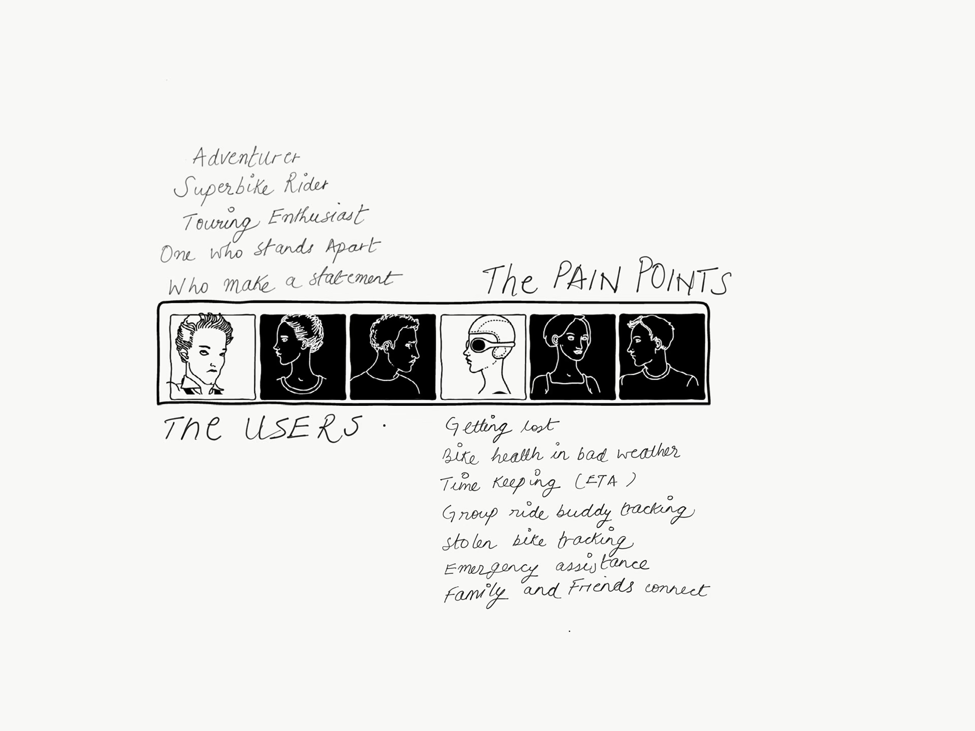
User personas and pain points identified across 1200+ bikers in 12 cities
Key pain points identified
Getting lost on unfamiliar routes · Bike health monitoring in bad weather · Timekeeping and ETA management · Group ride and buddy tracking · Stolen bike tracking · Emergency assistance · Staying connected with family and friends while riding
A platform for the complete riding experience
Research findings shaped a clear product vision: a comprehensive, integrated platform covering three phases of the riding experience before the ride, during the ride, and reliving the ride. The MVP was structured around three core pillars.
- Bike friendly routes and navigation
- Location sharing with family
- Theft and towing alerts
- Nearby mechanics
- Discover and share routes
- Group riding and buddy tracking
- Ride performance sharing
- Routes recommended by riders
- Bike diagnostics
- Battery performance
- Fuel economy
- Service alerts
Redesigning for Indian roads
Working from the existing app, I redesigned the interface with a focus on reducing cognitive load for riders clear visual hierarchy, minimal interaction during rides, and flows designed for one handed use while wearing motorcycle gloves.
I facilitated design sprints, created user journeys, wireframes, prototypes, and design specifications across both the mobile app and the display module feature flows. The design system covered typography, colour, iconography, and interaction patterns.
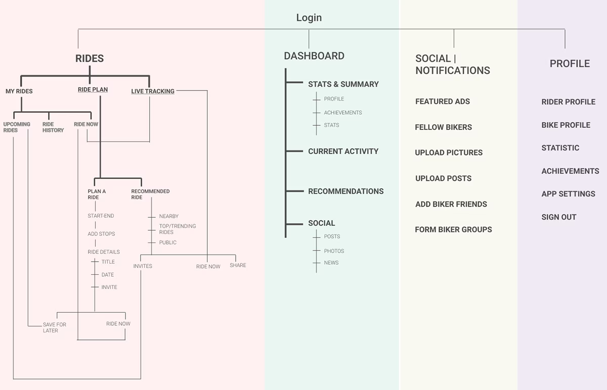
Full IA flow chart for the mobile app
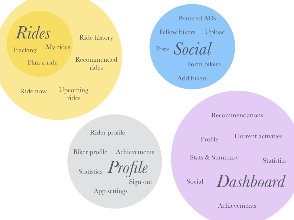
IA bubble map Rides, Social, Profile, Dashboard
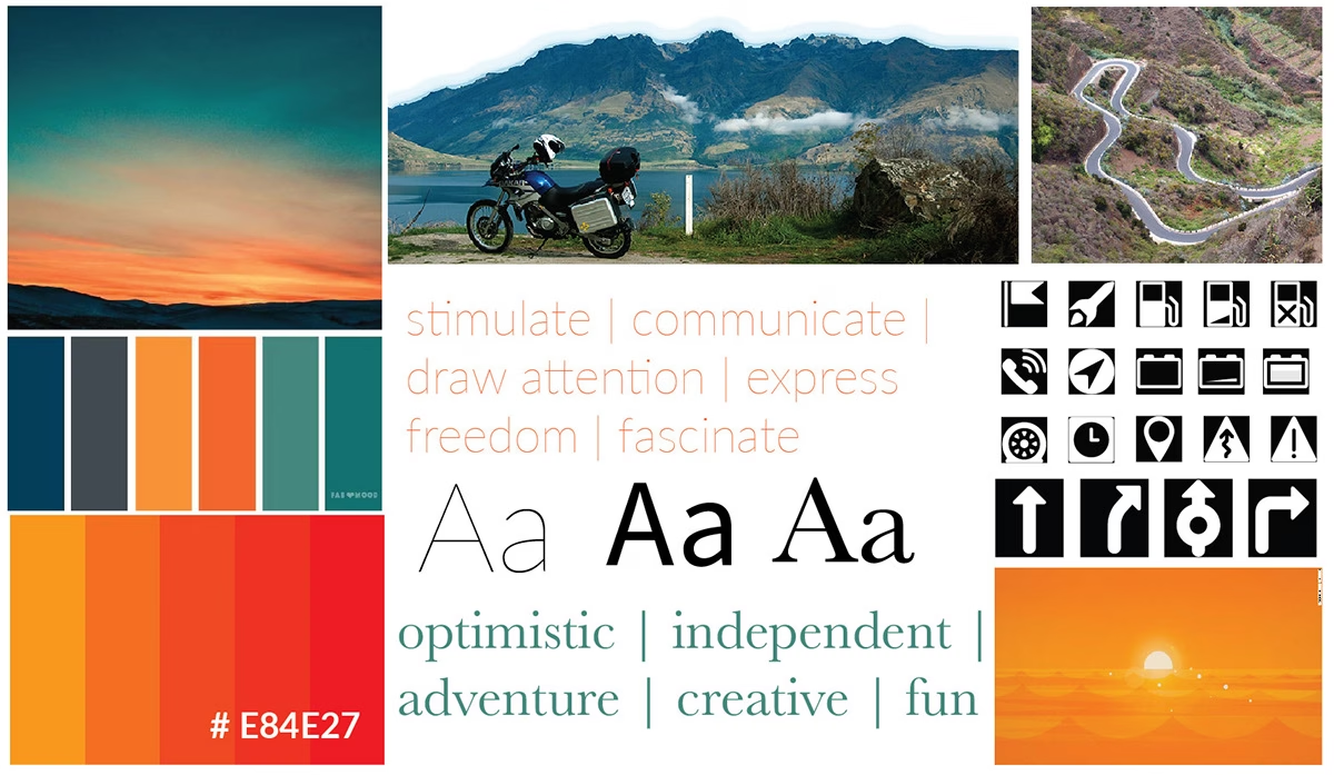
Mood board visual direction, colour palette, typography and iconography
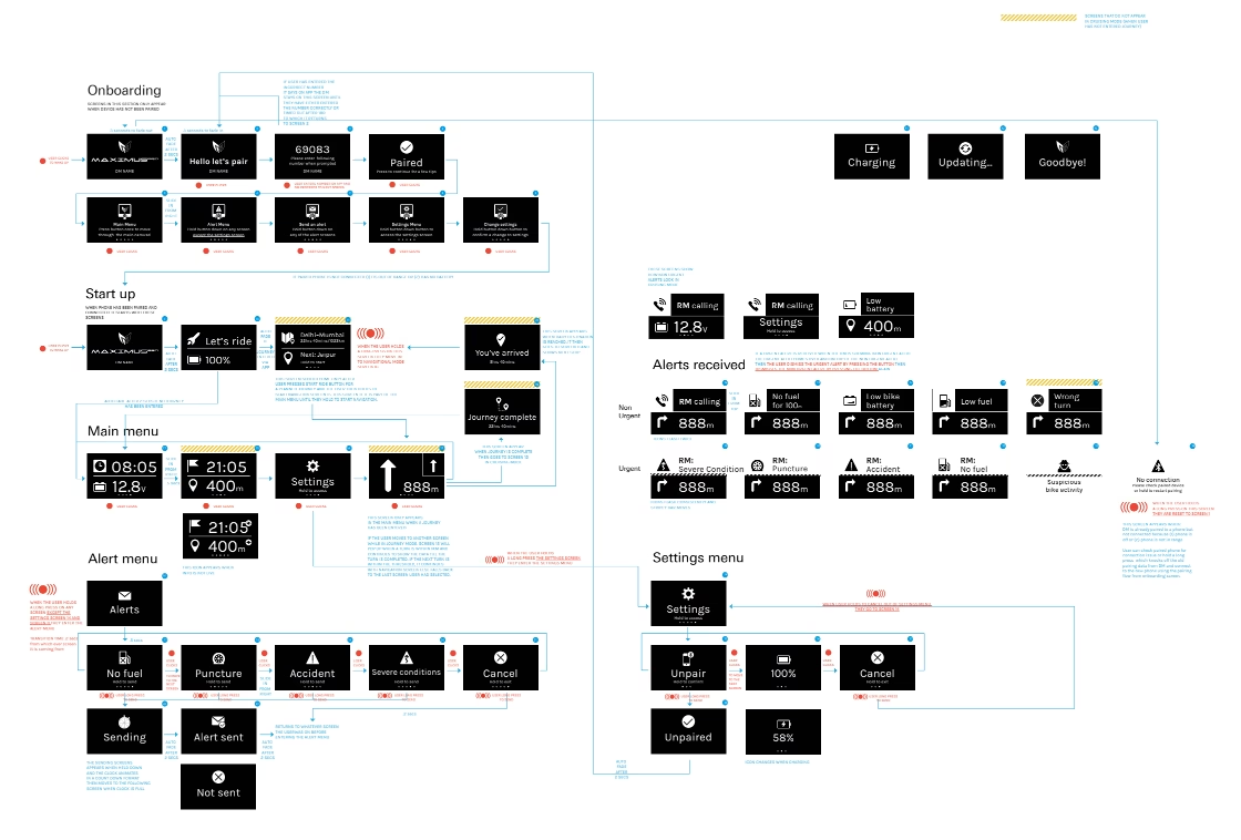
Display module feature flow onboarding, start up, main menu, alerts, settings
Adapting for Indian road conditions
A specific and important challenge was adapting the display module’s navigation interface for the Indian context. The original interface, designed in London, used navigation conventions that didn’t fully translate to Indian roads where signage, symbols, and road types vary significantly across states and are often inconsistent with Western standards.
I conducted research into road signage conventions across different Indian states, identifying the most commonly used and recognised symbols for the Indian biker. We tested these with users and refined the icons and alerts on the display module to reflect what Indian riders actually encounter on the road making the navigation genuinely usable in real Indian riding conditions.
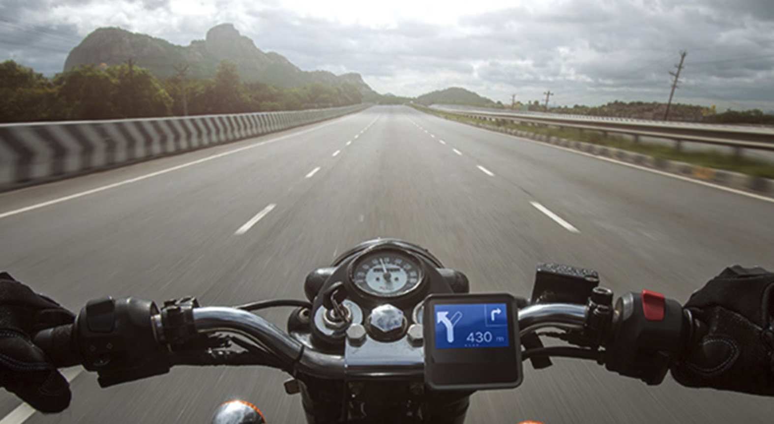
The display module mounted on the bike handlebar designed for glanceability in all light conditions
Note on screens: All screens shown were designed in Sketch (2017), the industry standard at the time. A Figma redesign of key screens is currently in progress and will be updated here shortly.
Testing the Add a Stop flow
I personally ran A/B testing on the Add a Stop feature a critical part of the ride planning flow using a controlled group of 40 bikers, including participants recruited near KTM and Harley-Davidson showrooms in Bengaluru.
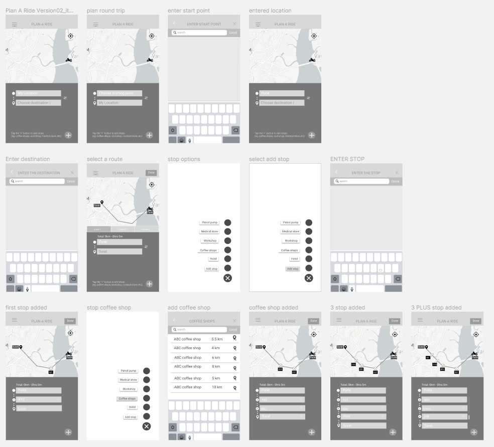
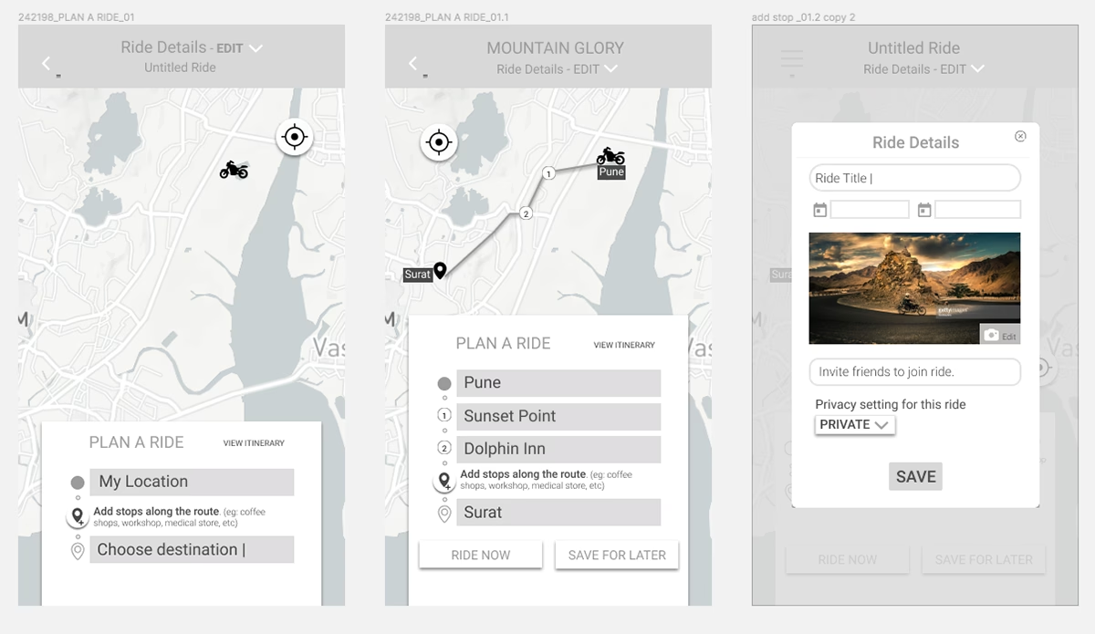
Low fidelity wireframe screen flows for the mobile app
Low fidelity mockups for the Add a Stop section
Hypothesis
Three hypotheses were tested: whether specific data entry points would improve transaction rate through the Plan a Ride page; whether placing inputs in the lower screen segment would reduce thumb travel time; and whether surfacing Add Stop after destination entry (rather than before) would reduce confusion about whether it was compulsory.
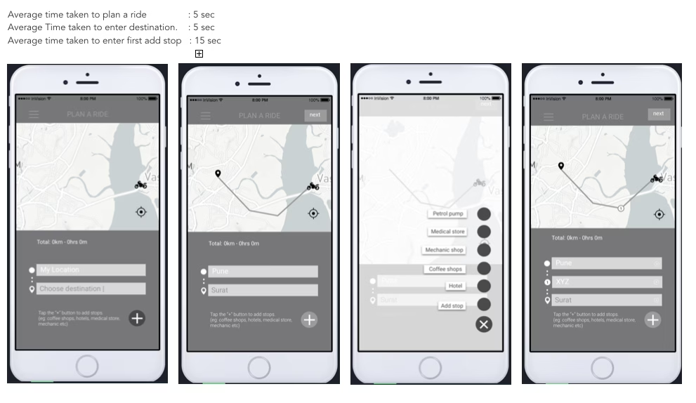
Variation 1 Stop options between location and destination fields
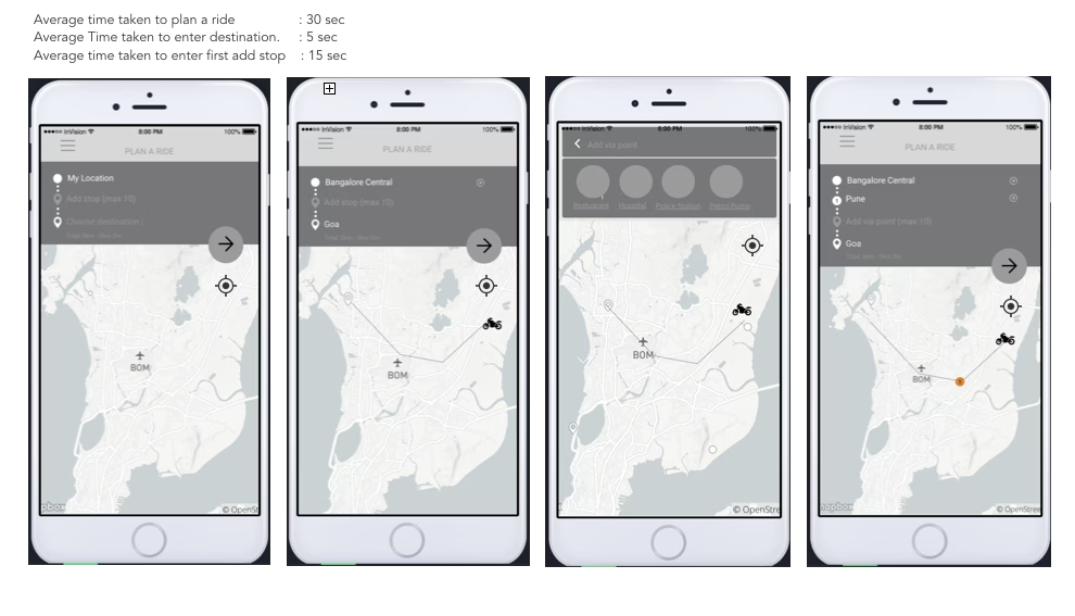
Variation 2 Stop options after destination confirmed (selected)
Stop options shown between location and destination fields
Standard placement stop options appeared mid form before destination was entered.
Stop options shown after destination is confirmed
Revised placement destination entered first, stops offered afterwards. Reduced ambiguity and cognitive load significantly.
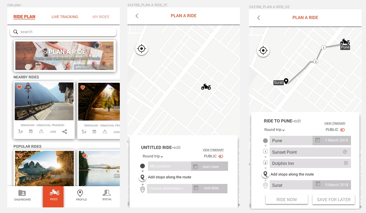
High fidelity mockup Plan a Ride section, Iteration 1
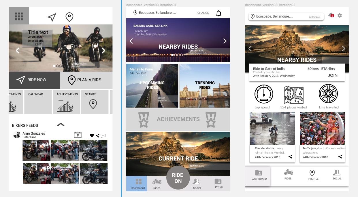
High fidelity mockup Plan a Ride section, Iteration 2
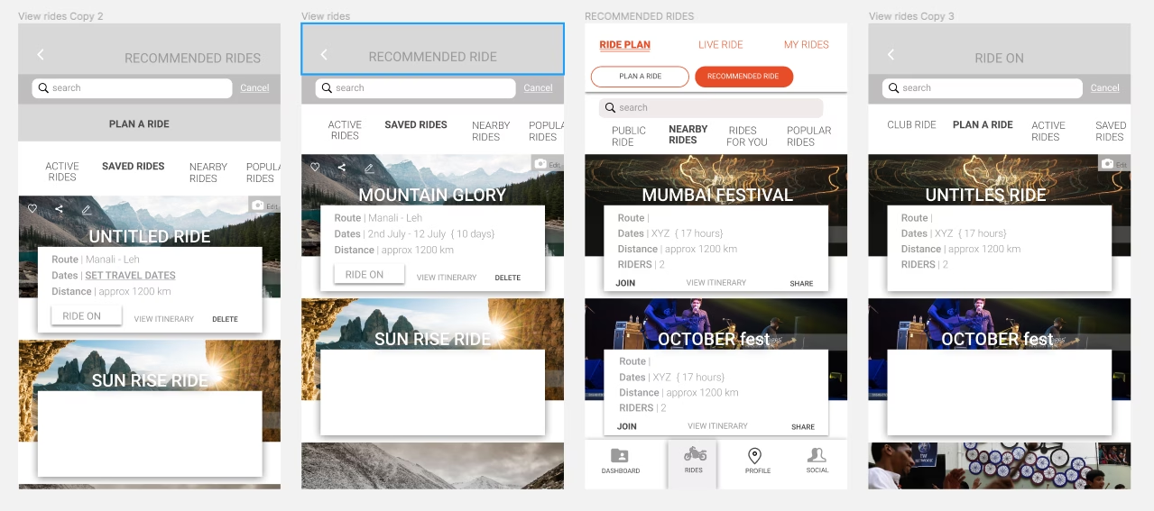
High fidelity mockup Recommended Rides section
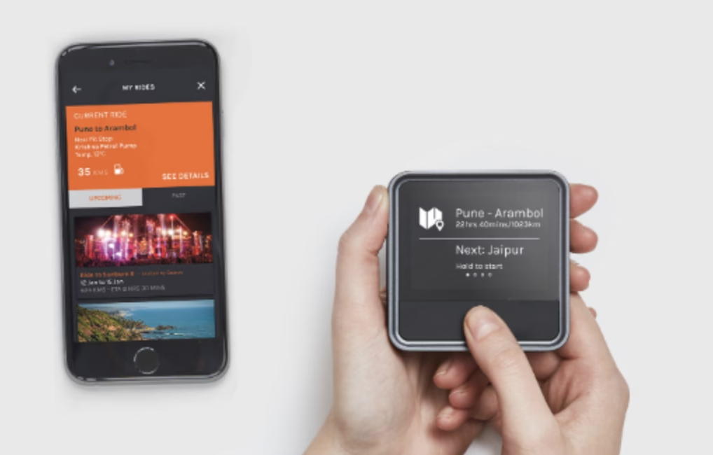
Maximus Pro mobile app key feature screens
Variation 2 was selected users completed the ride planning task with significantly less confusion and the flow felt more natural to how bikers actually think about planning a journey. This finding fed directly into the next development sprint.
Multiple rounds of usability testing were conducted across Android and iOS, in both controlled and real world riding environments using a Lean Agile process of continuous delivery and continuous improvement.
India Bike Week 2017
Product Launch
Maximus Pro was launched at India Bike Week 2017 in Goa one of Asia’s largest motorcycle festivals, attracting over 20,000 bikers from across India. The product was received positively by the biker community, generating strong interest and live feedback at the event.
I was present at the launch, interacting directly with riders and potential customers, gathering live feedback and recording insights for future product iterations. Each interaction at the stall gave us direct data on how riders engaged with the product in a real, emotionally charged environment.
“The MaximusPro used to be cumbersome to use and full of glitches when I started using it. But now it has evolved into a very user friendly and convenient product. The development team is very active towards feedback passed down by customers, and the latest version is close to being perfect.”
BikeWale Six month product review, August 2018The BikeWale review published six months after launch on one of India’s leading motorcycle platforms directly reflected the iterative design work done on the app. The reviewer specifically praised the ride planning flow, the via points feature, and the detour functionality: all core UX decisions from this project.
What happened to Maximus Pro
Maximus Pro was developed during a period when KPIT was actively exploring consumer mobility products alongside its core automotive software business. In 2018, following a major strategic restructuring in which KPIT merged and demerged with Birlasoft and refocused entirely on B2B automotive software for global OEMs, consumer products including Maximus Pro were quietly retired. The product never received a formal discontinuation announcement it simply no longer fitted the new direction.
This context is worth noting because it reframes the project honestly. Maximus Pro was a genuine first mover product one of the world’s earliest connected motorcycle platforms built during a window of ambition before commercial realities shifted. The UX work done during this period contributed to a product that reached market, attracted real users, generated press coverage, and launched at one of Asia’s largest motorcycle events. That it was later discontinued as part of a corporate restructuring does not diminish what was built or the rigour of the design process behind it.
“KPIT refocused entirely on automotive software at scale following its 2018 restructuring consumer products like Maximus Pro no longer fitted the new strategic direction.”
KPIT Technologies Company Journey, kpit.comWhat this project taught me
Joining as the first designer on a live, already deployed product taught me to work with inherited constraints rather than against them. The engineering team had built something functional my job was to make it human.
The most valuable lesson was the importance of context specific design. Navigation conventions that work in London don’t necessarily work in Bengaluru. Designing for a specific culture, a specific road system, and a specific riding community required genuine immersion not just pattern libraries.
Working to a fixed launch deadline with two parallel workstreams fixing the live app while designing the next version also strengthened my ability to prioritise under pressure and communicate design decisions clearly to non design stakeholders.