The Essence Of Design For Crafting Product for Seamless User Achievement
The core purpose of design is to construct a product that will assist the user in achieving a goal with as little difficulty or cognitive effort as possible.
“Design is not just what it looks like and feels like. Design is how it works.” –Steve Jobs
Great design is often comprehended for the attractive coordination of colours or the sequence of components. But, at heart, this unlikeness reflects two domains involved in designing applications — UX and UI design; which can also be engaging in developing products.
“Design is thinking made visual.” –Saul Bass
UX stands for User Experience; it is accountability with the product’s capability to allow the user to achieve their goal with little disagreement. At the same time, UI design stands for User Interface, which is answerable for the visual charm of the product.
The purpose of design is to ensure a product’s alleviation of use, incredible creation is often obscured; it isn’t straightforward, and it’s more so felt when utilizing the product.
Over time, products would grow into something well-designed and easy to use; unfortunately, this isn’t the case. Instead, poorly designed products leave users feeling frustrated and bumbling.
A good design is essential to a product’s triumph; when it allows its users to achieve a goal quickly, word-of-mouth will spread like wildfire.
“Good design is obvious. Great design is transparent.” –Joe Sparano
Let’s take a look at six elements that make a good design
“It is not enough that we build products that function, that are understandable and usable, we also need to build products that bring joy and excitement, pleasure and fun, and, yes, beauty to people’s lives.” –Don Norma
Table of Contents
1. Affordance
A product’s affordance is the association between the product and the user, derived from the product’s features and the user’s abilities.
The concept of affordance came originally from perception psychologist James Gibson in 1979. The idea was later modified and made more famous by Don Norman in his book “The Design of Everyday Things” in 1988.
The faucet, for example, its form invites you to rotate the knob, but no water comes out if you do so.
And because of this false affordance, they had to add a help text to show how to open the faucet: by tilting it sideways! Rotating does do something: it changes the temperature of the water.
But that only helps a little if you can’t get the water running in the first place.
2. Signifiers
Signifiers determine where action should take place with the product. It should communicate the intent and function of the product to the person using it.
Signifiers are more critical than affordances.
They communicate how to use the design. A signifier can be words, illustrations, sounds, or anything that shares its function effectively with the user.
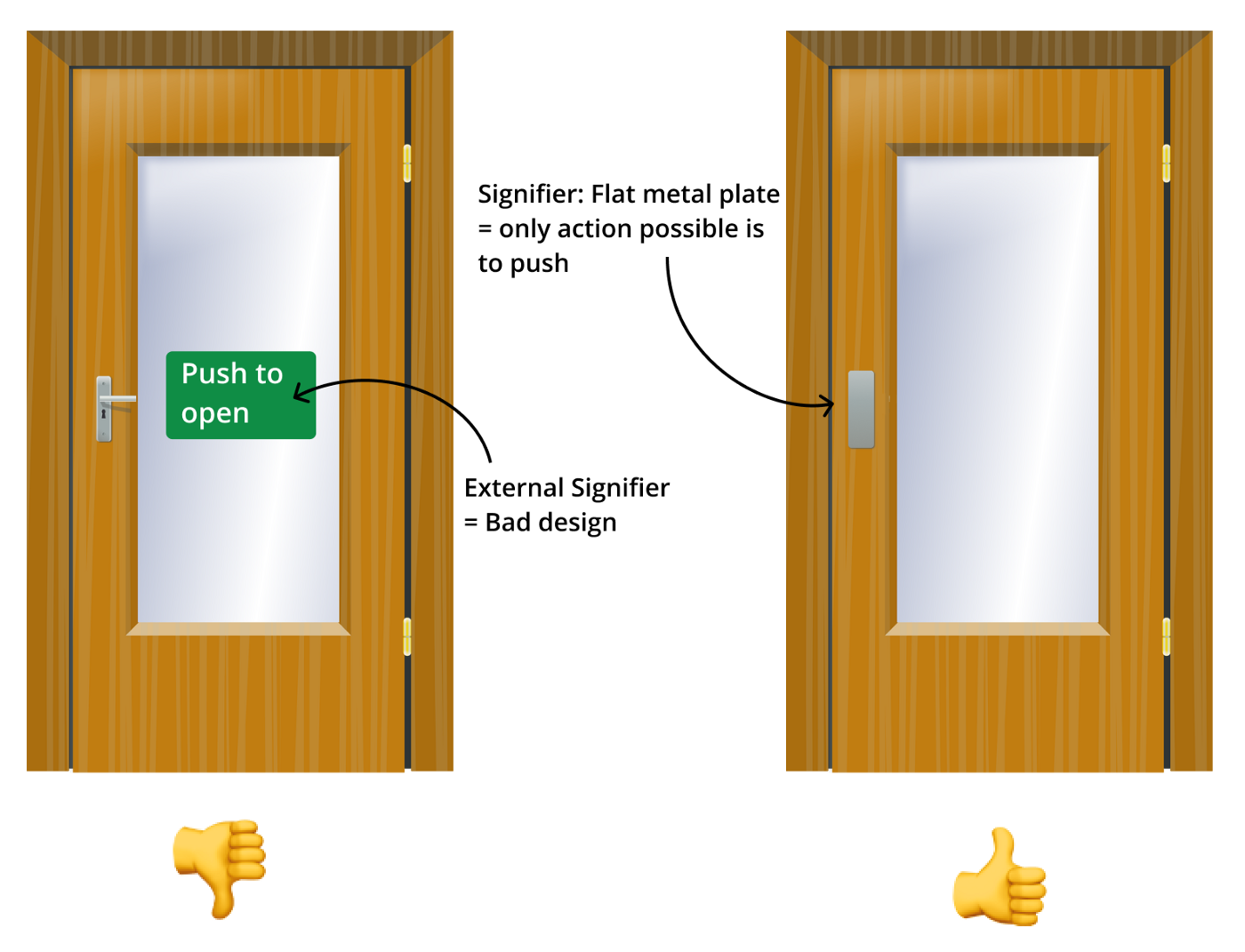
Sometimes, an affordance isn’t explicit; a signifier should be used in these cases. For example, a door’s ability to open and close would only be apparent with the handle.
Without a handle, a door could appear to be a wall or window at first glance; in this case, the handle is a signifier. Signifiers are great tools to help improve user interfaces; for example, hover states are a great indicator that a component on the screen is actionable.
An affordance defines what the product can do whereas a signifier indicates where the action should be made.

A clear indicator of a bad design is when an external signifier is required, such as a “push, don’t pull” sign on a door or “click here” text on a website. Of course, an external signifier wouldn’t be needed if a product was designed well.
3. Constraints
Constraints are used to limit the possible actions the user can make. Rules are mainly significant when certain functions could lead the user away from their goal or cause an error.
For instance, a paper shredder like the one pictured here. It has sharp, robust blades to cut through the paper quickly and effectively.
There are constraints that these types of shredders have in place to make sure you put everything together safely before using it.
For instance, if you open the shredder off the bottom trash can, the power will be automatically cut off, and the shredder will not work.
Constraints: If you open the shredder off of the bottom trash can, the power will be automatically cut off and the shredder will not work.
4. Mapping
Well-designed products map their features based on the knowledge a user would already have. The designer cancan uses the user’s prior understanding to minimize the additional information required to operate the product.
For example, if you were to walk into a room with four downlights — one in each corner of the ceiling, you would be able to conclude which switch operated which light if the buttons were mapped to reflect the position of the lights; the button on the top right corner of the switchboard would control the switch on the far right corner of the room.
Stovetops are the worst culprit of wrong mapping; switches on a stovetop are usually placed vertically along the side or horizontally along the bottom; labels are required.

5. Feedback
It’s essential to let the user know the product’s state, which is the feedback’s purpose. Feedback doesn’t need to be blatant; subtle feedback works best if it’s quick and instructive.
An elevator button that lights up or a simple screen shake and buzzing sound for an incorrect password.
It’s essential to have feedback; it’s even more important to do it right; poorly executed feedback tends to be worse than no feedback.
Uninformative feedback can be pretty frustrating for a user — such as cryptic error messages on an application, whereas too much feedback causes the user to ignore them entirely.

6. Conceptual Models
A conceptual model is a simplified understanding of how a product or aspects of a product work.
Users build conceptual models over the period using the affordances, signifiers, constraints, and mappings of products they come across.
The best-designed products use their users’ conceptual models because the design ‘piggybacks’ off of previously well-designed products that the user is already familiar with.
For example, a user can conclude the purpose of a teapot and the steps required to use the product from its affordances, signifiers, constraints, and mappings.
Once a user has constructed a conceptual model of a teapot, they will quickly understand the what and how of all teapots they come across in the future as long as they are designed comparably.
User interfaces utilize conceptual models we’ve constructed from the physical world.
For example, we know that pulling an item to a trash icon would delete the item.
Conceptual models are used to predict the outcome of an action, which is why products that counter existing conceptual models lead to confusion and errors.
For example, it can be problematic if the icon for a ‘send’ button resembles a trash can.
For this reason, it is essential for designers to comprehend the conceptual models their users hold, not only to ensure their design uses these conceptual models but also to ensure that they don’t nullify them.
A good design does not translate to an aesthetically attractive product because the two tend to dispute each other in specific scenarios.
A genuinely well-designed button on a user interface would appear to be 3-dimensional to signify its click-ability; However, such design is what you would expect in a 1990s website, whereas modern-day applications would connect to the visually-pleasing flat-design trend.
Designers are occasionally faced with the challenge of surrendering good UX for a visually-appealing UI and vice versa, where they draw the line dangling on the context in which the product is used.
For example, a hazard sign must be immediately apparent, so a hideous combination of bright colours is used.
The visual appeal is ultimately sacrificed on its excellent design.
Items used in hazardous situations, such as hospitals and ambulances, tend to be heavily colour-coded, regardless of their unappealing look.

This article has boosted your wisdom of good design and elevated your fondness for intuitive products and applications.
The next time product goals are effortlessly met, take the time to appreciate the effort the designers have put into guaranteeing your positive experience.
Read more articles exploring the dynamic interplay between design, user experience, artificial intelligence, and technology here.


Leave a Reply